My crappy term paper for Art Stud 202. I’m still publishing it here in the hopes that someone might take off from where I left off. Do let me know if this helps you with your own research.
Around June 2020, when the Philippine government announced that Metro Manila will be under General Community Quarantine, public transportation was allowed to operate at a limited number of passengers. Among the different modes of transportation, the LRT-1 reopened. Visual cues were scattered around each station to inform the public which direction to go, where to standby on the platform or sit inside the train. However, the x-mark that the management decided to use confused a lot of passengers. These passengers were standing or sitting in places where the x-mark wasn’t placed. Many people using the trains or have seen photos of the situation on social media pointed out this confusion. Some people blamed these passengers for not being able to follow and deemed them as “pasaway”. Although, some also defended these passengers. When one sees an x-mark, the human mind associates it with something “wrong” or “negative”. Therefore avoiding the visual cue. Or on the other hand, even if the passenger is guided or informed that the x-mark is where they should stand, the visual cue is too small. (Interaksyon, 2020). Were the people not disciplined or was it an error in design? A misuse of signs and symbols?
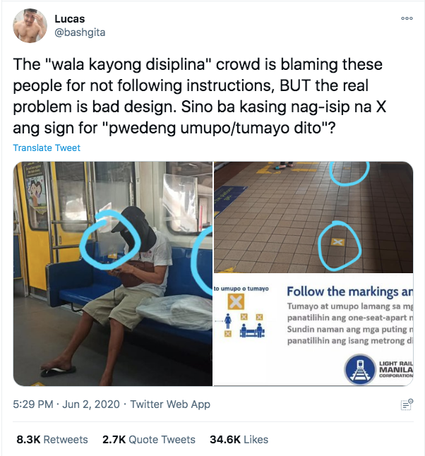
Fig 1: Screenshot of @bashgita’s viral reaction on LRT-1 visual cues. (Source: Interaksyon, 2020)
Signs prompts, and symbols are tools that can influence human behavior. We see them every day from the gadgets we use (e.g. power on/off & save icon), on the streets (e.g. road signs), it also warns us of potential danger or threat to our safety (e.g. construction ongoing), or now with the pandemic, it reminds us to follow safety guidelines (e.g. no mask, no entry signs, physical distancing visual cues). In understanding the sign to behavior process, we might discover how to make these visual cues better and be able to digest the information. This knowledge, if used correctly, may help the government, private institutions, or individuals in ensuring safety against Covid-19. According to Geller (1982), an effective sign should be (1) close to the point of action, (2) is clear in instruction what action should be done, (3) it should also be an action that is convenient for the actor, and lastly (4) the messaging should be done in a polite tone and must not sound demanding. (Meis and Kashima, 2017).
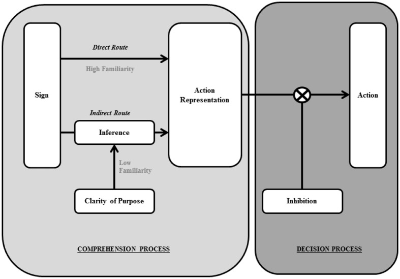
Fig 2: The two-stage model (Source: Meis and Kashima, 2017)
Another factor that should be considered when producing visual cues is the culture of the target audience. The world is experiencing the same situation because of COVID-19 (illness, death, social distancing). However, the medical information we receive is presented differently because of our cultural differences (behaviors; social, economic, and political structures) (Lewis, Elizabeth, et al., 2020). For example, on ground zero of the virus, they released a dramatic comic strip depicting different storylines. From people being carefree to the quick spread of the virus, hospital scenes of family comforting each other, to showing how people of different backgrounds are coping with isolation, and also showing images of hope that one-day people may go outside and see nature bloom. Another example, cartoonist Rocky Sawyer released an altered image of Uncle Sam, a well-known image that represented the US Government that was used for propaganda, holding a hand sanitizer and telling the audience to clean their hands. What’s ironic about this is that Uncle Sam is shown to not use his mask properly, a political commentary about the US Government implementing rules to its citizens when they don’t comply with them themselves. Lastly, for Latin American countries like Chile, wherein kissing and hugging was a form of greeting loved ones, the government released a poster that appeals to that culture. In the post that said, “Te Quiero, Pero A Un Metro” which translates to “I love you but from a meter away”, it reassures the audience that their love and care for their family can still be expressed while still following physical distancing guidelines.


Fig 3-6: China Anti-Epidemic Guide from (Source: Xinhua News, March 29, 2020)
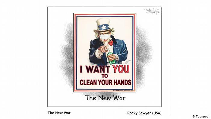
Fig. 7: The New War (Source: Rocky Sawyer, March 15, 2020)
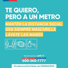
Fig. 8: Social Distancing campaign (Source: Gobernación Cordillera Facebook July 27, 2020)
In analyzing the visual designs and graphics for Covid-19 in the Philippines, I mainly looked at three institutions namely; the Department of Health, Department of Transportation, and Public Spaces (Malls and Food Establishments).
In July 2020, the Department of Health launched the BIDA Solusyon campaign on Facebook with a superhero theme and comic style of visuals. BIDA stands for “Bawal walang mask”, “I-sanitize ang Kamay”, “Dumistansya ng Isang Metro”, and “Alamin ang Totoong Impormasyon” aims to remind Filipinos of the safety guidelines that they should follow. Since the target audience of DOH is on a national level, the Filipinos depicted in their campaign come from different sectors of the population. The young professional being represented by the girl, the corporate workers represented by the man wearing a polo shirt, the construction worker wearing his gear, and the concerned mother present in most households. The use of bright green, yellow, orange, red, and blue color palette was utilized to catch the attention of Filipinos as well as to highlight the important bits of information.
The mass appeal of the visuals and the translation to Philippine culture can be seen in one of their physical distancing guidelines. In a particular post, they showed different objects that can be typically found on the streets of Manila (e.g. an ice cream cart, motorcycle, and a bench) as a visual cue for comparison with the one-meter-apart social distancing guidelines. They also made use of the image and popularity of celebrities, particularly one that appeals to the mass audience, like Alden Richards as a way to boost the awareness of the campaign. To transcend the awareness of the campaign and make it interactive, they made Viber stickers that users could send their colleagues, friends, and family members.
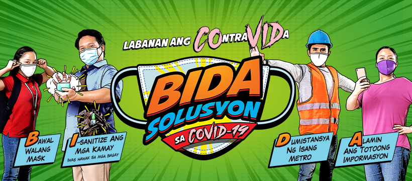
Fig. 9: Cover Photo (Source: BIDA Solusyon Facebook, July 1, 2020)
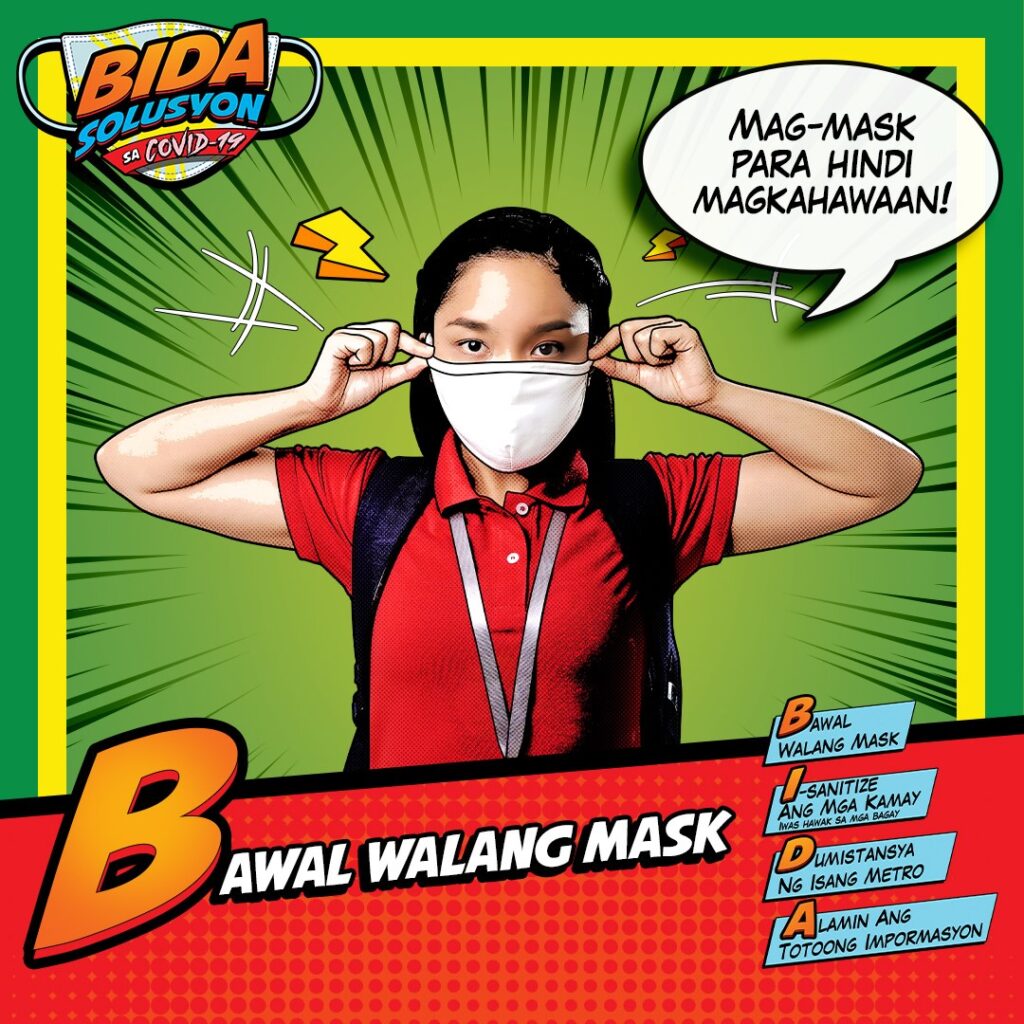

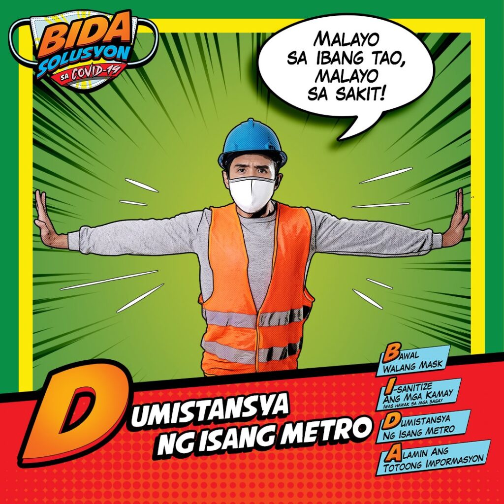
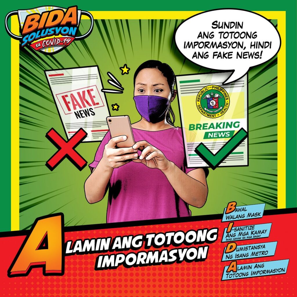
Fig. 11-14: Meaning/message of the BIDA acronym (Source: BIDA Solusyon Facebook, July 2, 2020)
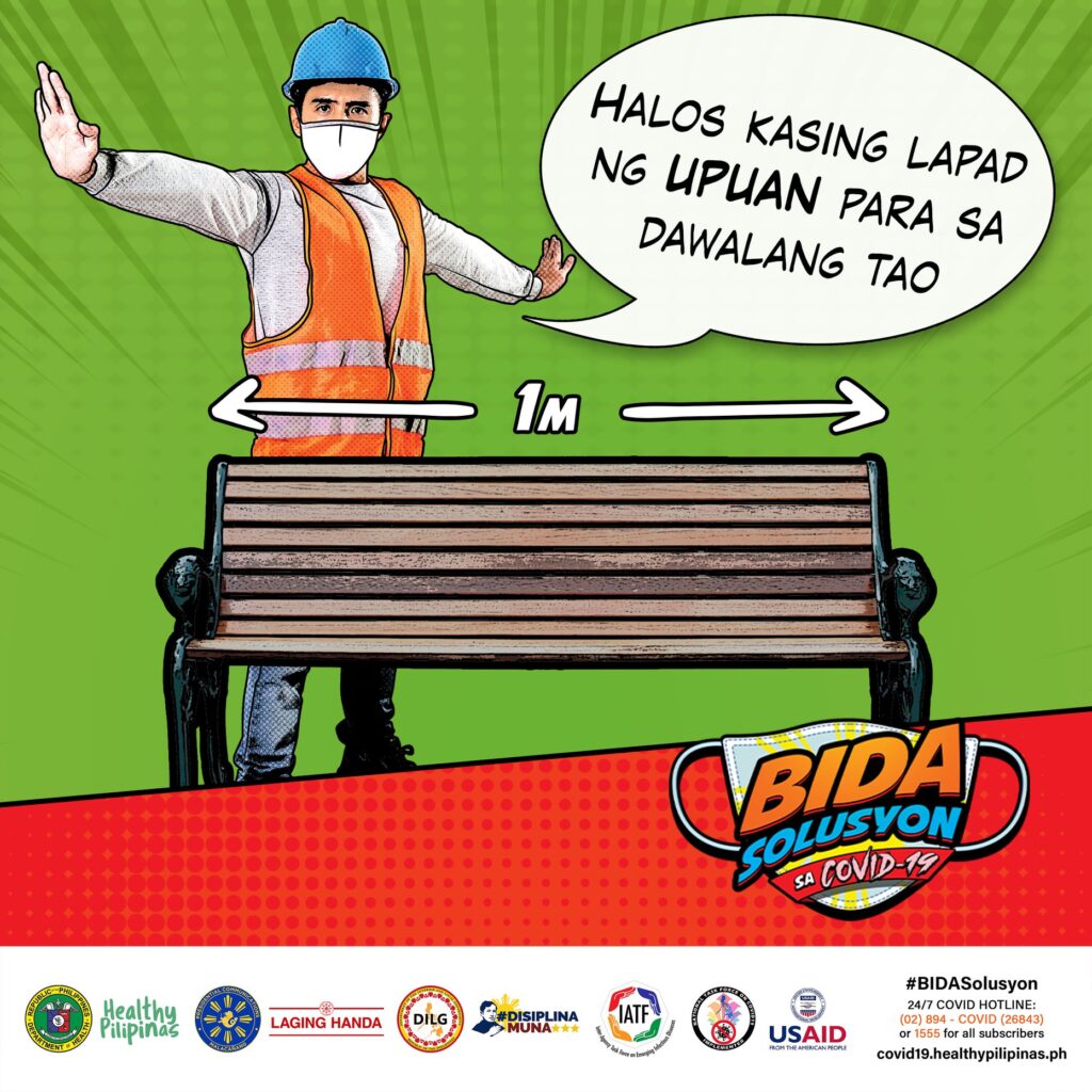

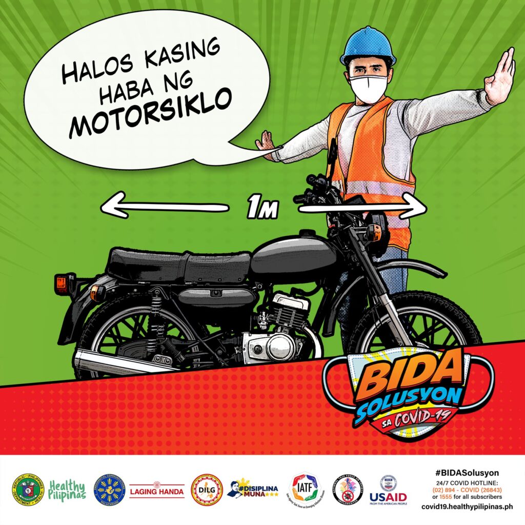
Fig. 14-16: Social distancing posts (Source: BIDA Solusyon Facebook, September 23, 2020)

Fig.17: Announcement of Alden Richards as endorser (Source: BIDA Solusyon, July 8, 2020)
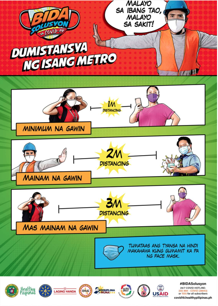
Fig. 18: Social Distancing visualizer (Source: BIDA Solusyon Facebook, August 9, 2020)
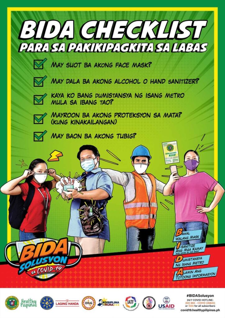
Fig. 19: Reminders for going outside. (Source: BIDA Solusyon Facebook, July 26, 2020)

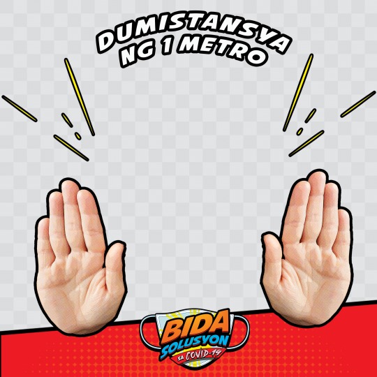

Fig. 20: Facebook profile picture frame (Source: BIDA Solusyon Facebook)
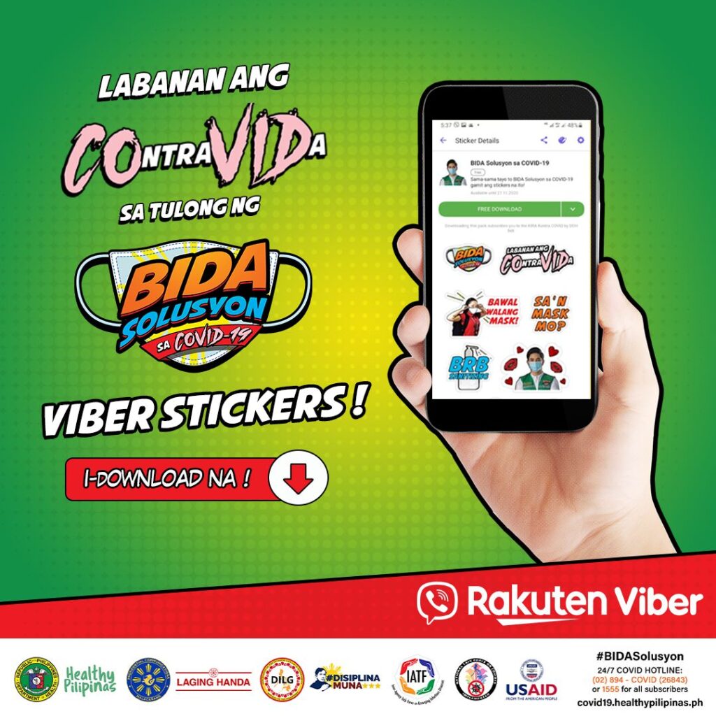
Fig 21. Viber Sticker announcement (Source: BIDA Solusyon Facebook, September 25, 2020)
Presented with all these visuals from the Department of Health, they have effectively translated universal COVID-19 health protocols to the Filipino audience. Although, we might not be able to say the same for other government agencies.
On the Department of Transportation’s Facebook page, upon the announcement of General Community Quarantine status in Metro Manila, they released the guidelines for the different modes of transportation. On the surface level, the visuals that they released online were very clear with the use of green markers as an indicator for where the passengers will sit. However, on the streets, it was a different story. Workers who desperately needed to commute flocked the streets in the hopes of getting to work. There were insufficient/non-existing guides or markers that should’ve been able to control the crowd of workers. This serves as a lesson for those in charge that without proper follow-through, may it be through the use of visual cues or personnel available on-site, the people would be less likely to adhere to the guidelines.
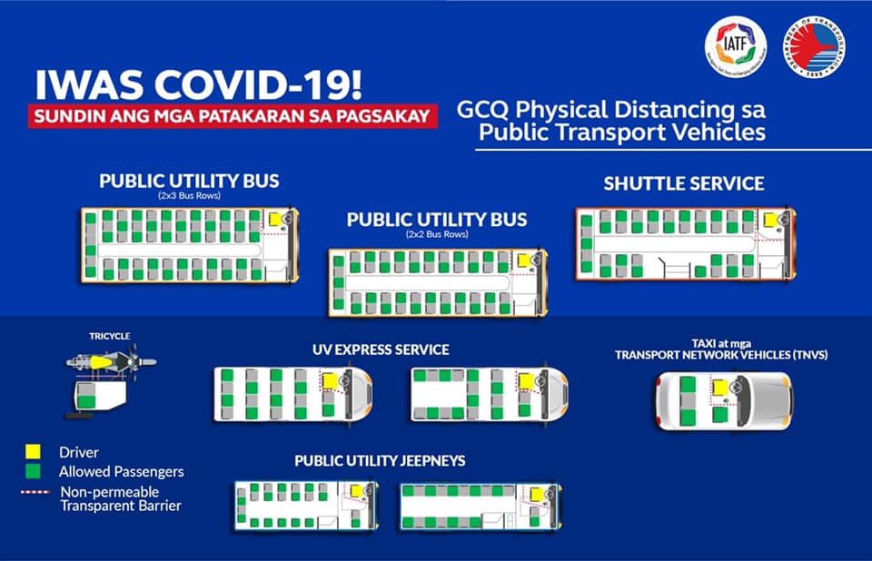
Fig. 22: Physical distancing guidelines for different modes of transportation. (Source: Department of Transportation – Philippines Facebook, May 1, 2020)
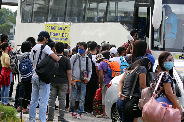
Fig. 23: Photo of the first day of GCQ in QC (Source: The STAR, June 1, 2020)
Going back to the issue regarding the LRT-1 visual cues, it was another instance wherein the visual cues were not able to prompt the people to follow the guidelines. And the problem lies with the visual cue. The designer was not able to consider the different meanings that humans associate with the x-mark. Ever since our formative years, the x-mark has been an indicator that something was wrong or incorrect. It is often placed beside a visualization of an action or behavior that is prohibited. The universal application of this symbol was even used in one of DOH’s campaign which proved to be effective.
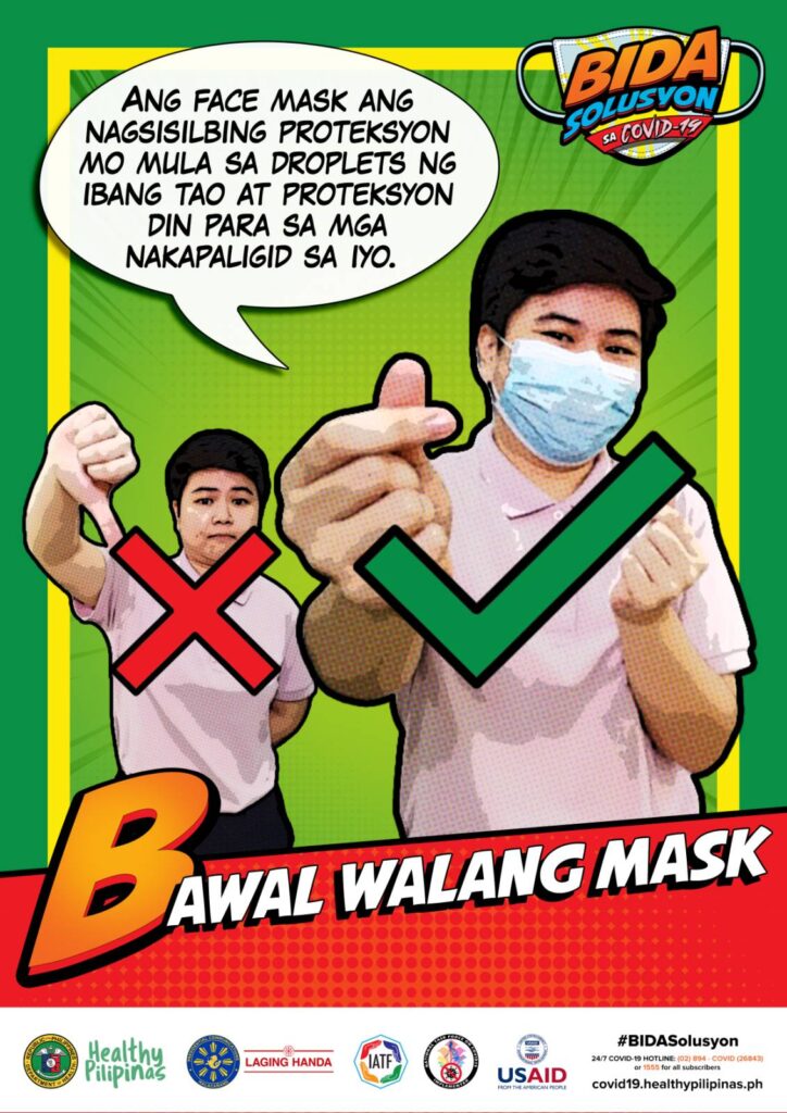
Fig. 24: Use of x-mark to discourage not using a face mask (Source: BIDA Solusyon Facebook, July 9, 2020)
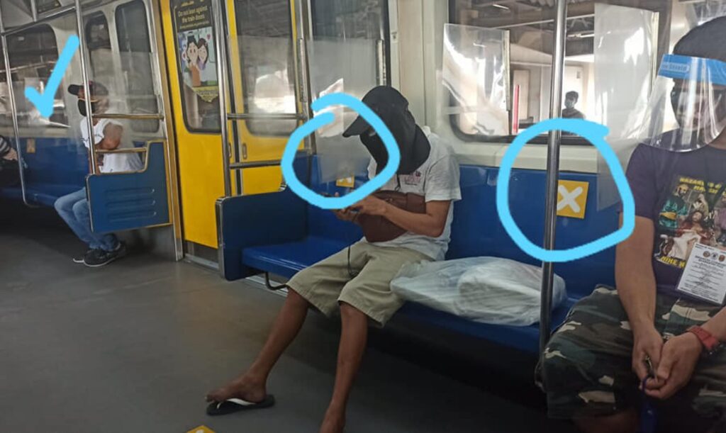
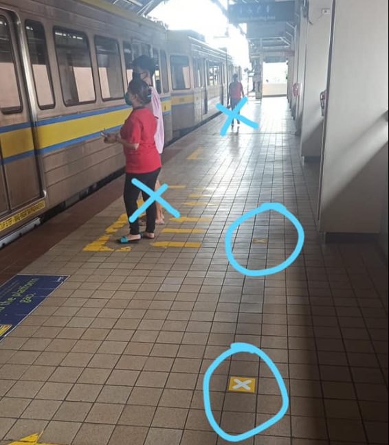

Fig. 25 – 26: LRT-1 visual cues and guidelines (Source: @bashgita on Twitter, June 2, 2020)
Arapoc and Savage (2020) suggested a heuristic set of visual cues and presented examples of visual cues in transportation from other countries. The heuristic set of visual cues utilize the existing usage of colors. For example, the colors of a stoplight may prove to be effective also when applied to infographics. In Australia, they made use of a big check-mark in the color green. With the symbol associated with something correct and a color associated with the action to proceed, it is an effective visual cue.
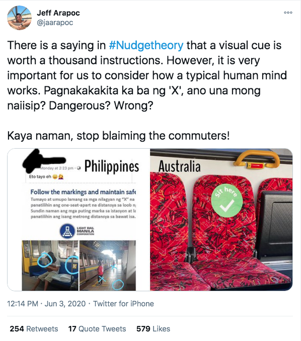
Fig. 27 – 28: Screenshot of @jaarapoc’s reaction on LRT-1 visual cues. (June 3, 2020)
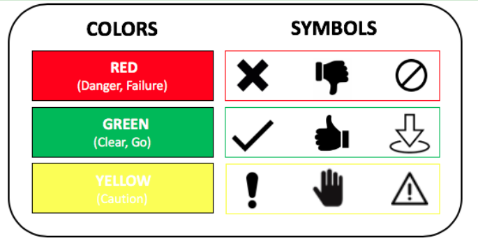
Fig. 29: Heuristic set of visual cues proposed by Arapoc and Savage (2020).
Although, during my research, I also stumbled upon the same visual cue applied to a different mode of transportation. In this instance, the x-mark was also used as an indicator of where the passengers should sit. It’s important to note that, in the photo below, military personnel can be seen. This implies that the reason why, in this instance, the x-mark was effective was that there were people who provided additional guidance.
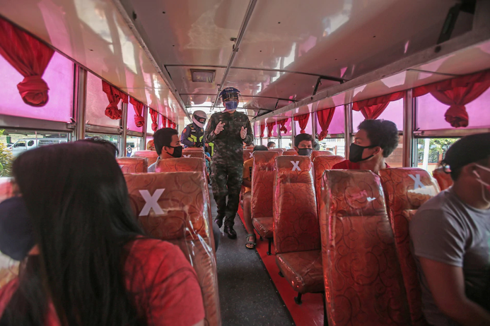
Fig 30. Commuters sitting on seats with x-mark on a bus from Rosario going to San Fernando (Source: ABS-CBN News, May 8, 2020)
Within the Local Government Units, an example of effective visual cues was rolled out in Baguio and Pasig City. Regardless of the color differences, both instances made use of the footprint symbol as an indicator of where a person should stand in a queue.
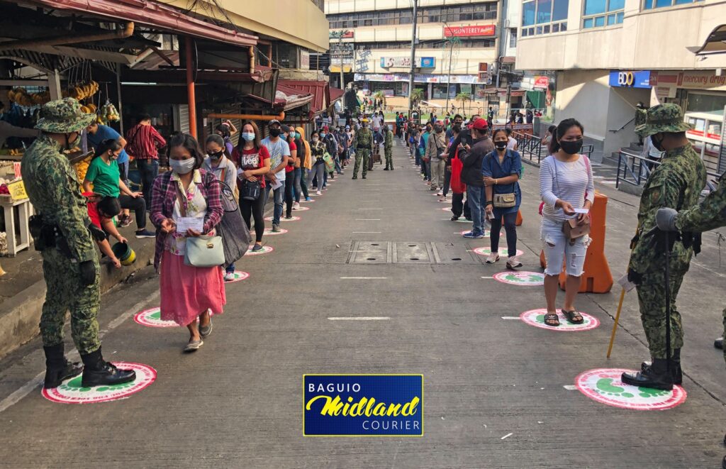
Fig. 31: Organized market day in Baguio (Source: Baguio Midland Courier, April 27, 2020)
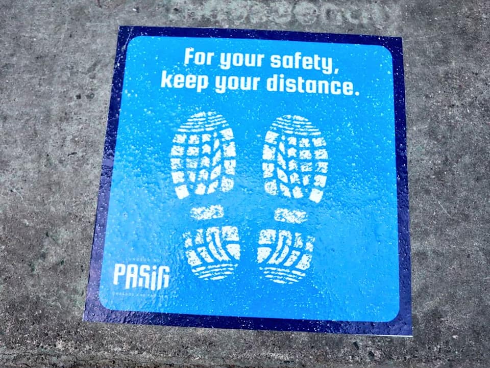
Fig. 32: Pasig City’s visual cues. (Source: Vico Sotto’s Facebook, May 2, 2020)
Now, let’s take a look at visual cues available in public spaces. In the Philippines, there is a significant amount of malls around the metropolitan area. Pre-pandemic, malls generate a high number of foot traffic given that this is where people would usually buy the things that they need that is corresponded by a number of employees that are stationed there. And since its reopening, malls have become high risk areas to contract Covid-19. This makes it necessary for these businesses to implement health protocols through the use of visual cues. As observed, all malls have rolled out different visual cues according to their branding. Again, the designers from these private institutions have utilized images that are closely related to the message that they wanted to convey. For example in Ayala Malls’ safety guidelines Facebook post, they made use of icons and text. A clock to indicate operational mall hours. A mask to remind customers that it is essential to wear in order to enter the premises. A thermometer to indicate that a temperature check is also mandatory for entry. This can also be seen on-site for consistency and also to inform people who might not have seen the announcement online. As presented below, the same theme can be seen across all malls. The differences in the execution of the safety guidelines, in terms of aesthetics, were based on the target market of the establishments.
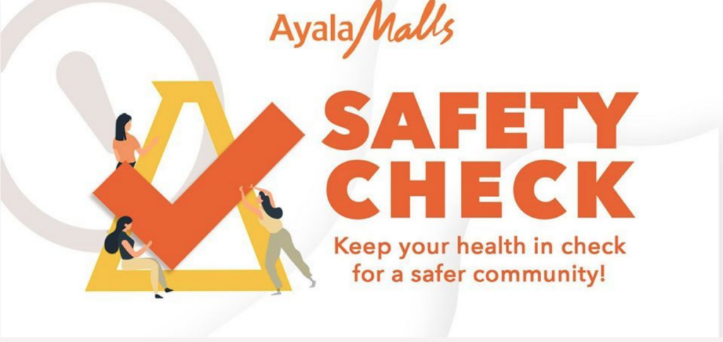
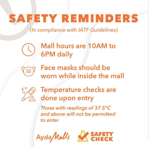
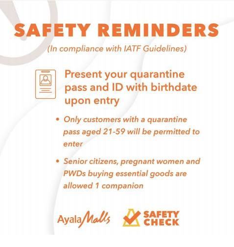
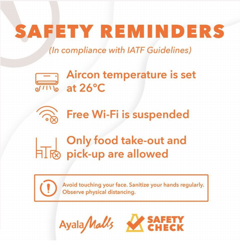
Fig. 35-38: Safety guidelines using icons and text for reopening (Source: Ayala Malls Facebook, May 20,2020).
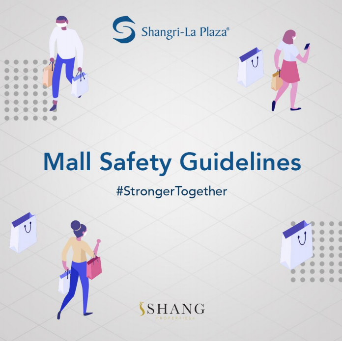
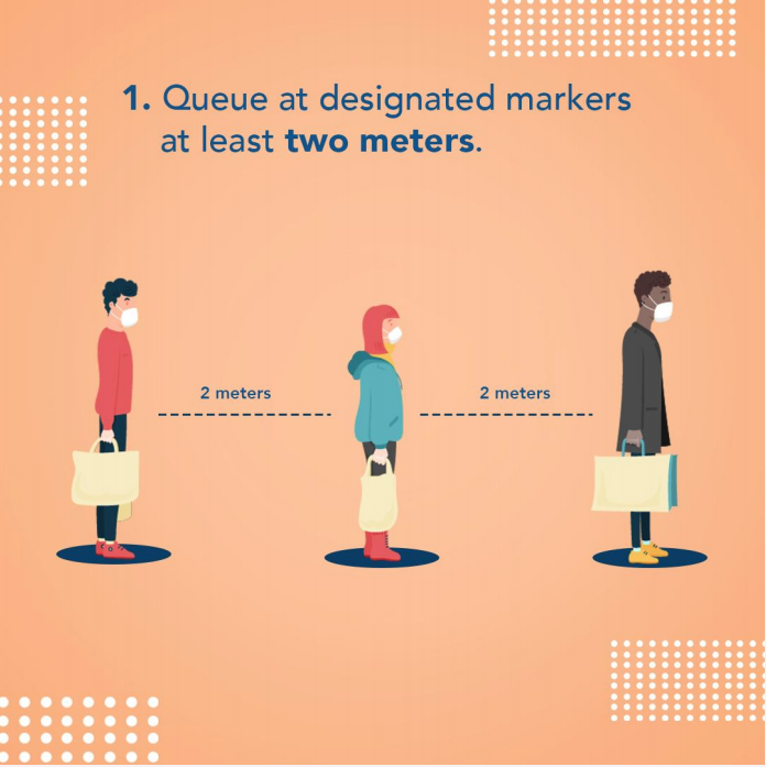

Fig. 39-46: Safety guidelines using vector illustrations and text for reopening (Source: Shangri-La Plaza Facebook, May 21,2020).
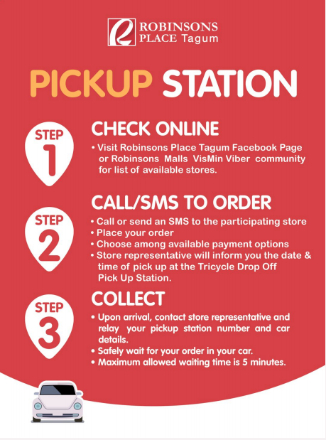
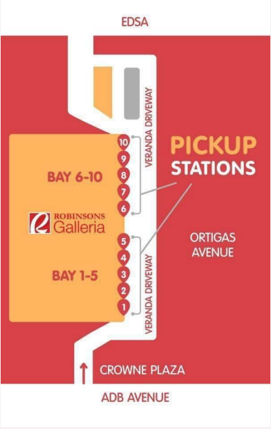
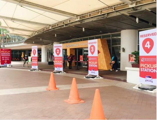
Fig. 47-51: Pickup Station infographic guidelines, maps, and on-ground signages. (Source: Robinson’s Facebook pages, June 3,2020).
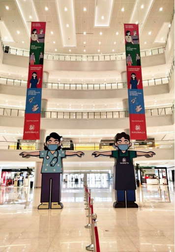
Fig. 52-54: Visual cues using a cartoon image of frontliners to facilitate crowd control and physical distancing. (Source: SM Megamall, June 1, 2020)
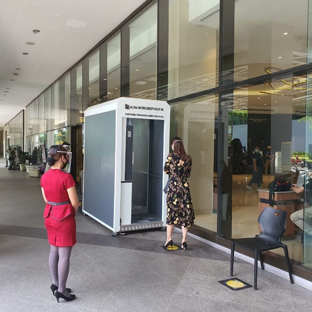
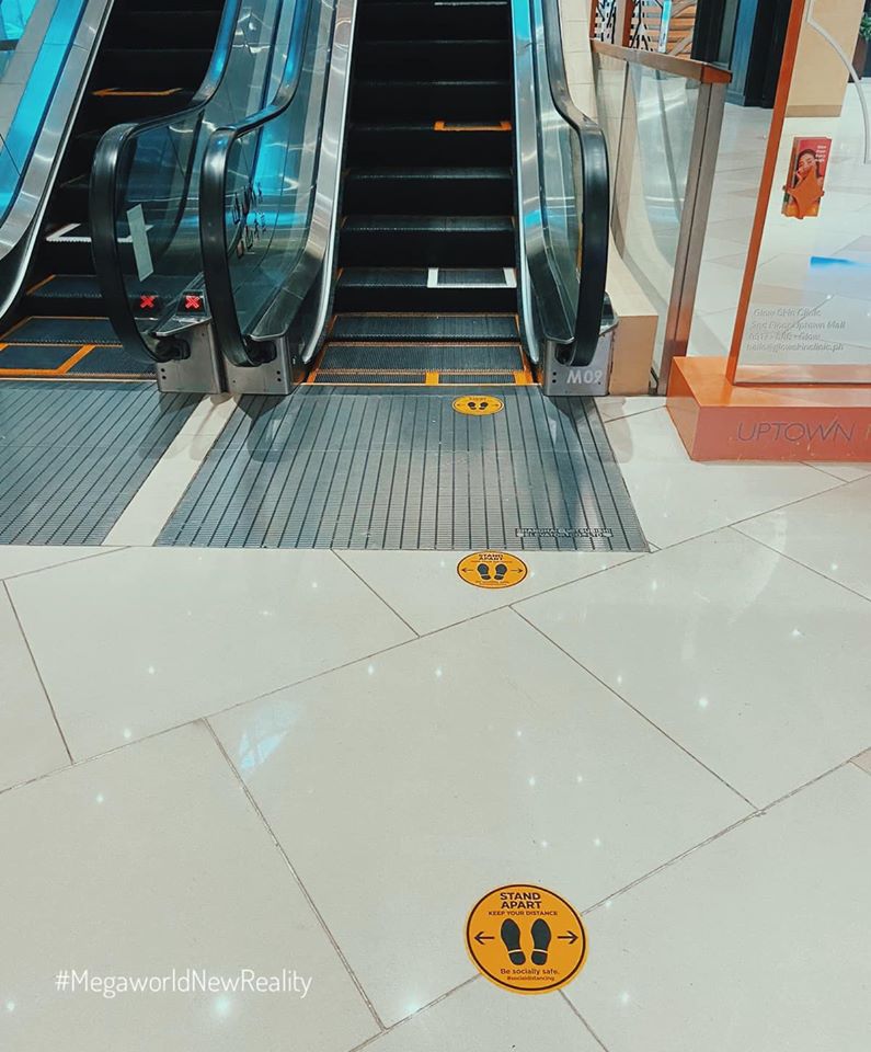
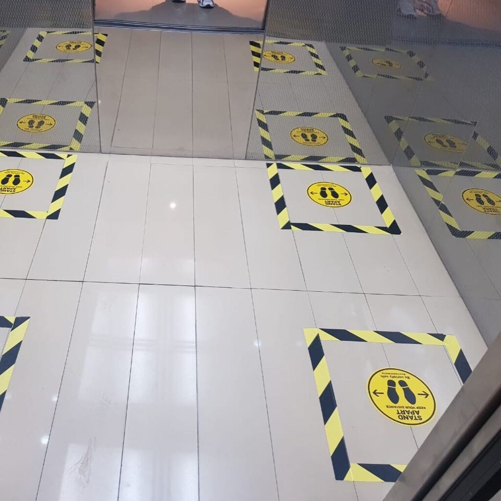
Fig. 55-57: Entrance, escalator, and elevator markers.(Source: Uptown Mall Facebook, July 24, 2020).
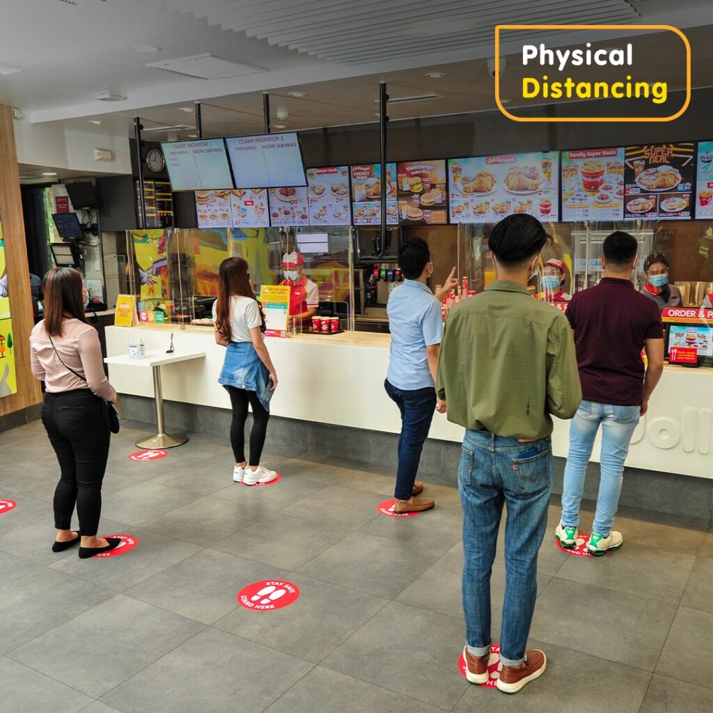

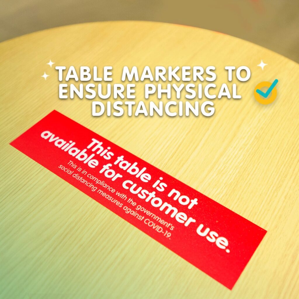
Fig. 58-61: Visual simulation of safety procedures using photographs, text and markers (Source: Jollibee Facebook, August 26,2020).
With all the information gathered, it rings true that visual cues and images are tools in changing the behavior of the Filipinos that is tantamount to ensuring their safety from COVID-19. These visual cues must always consider color symbolism (common use of green, yellow, red on markers), universal icons (check & x-mark, footprint icon, etc), and imagery (people wearing masks, visual simulation of physical distancing). Effectivity of visual cues also lies in its familiarity, clarity, proximity, and frequency of these images. The translation of the safety guidelines to the Filipino culture (shown through particular representations of sectors, objects, and places depicted) provided additional depth and clarity in giving prompts. However, we must also consider other factors that come in to play such as the ineffective follow-through visual cues on-site, or isolated circumstances, social traditions, and political climate.
Reference:
Arapoc, Jefferson, and David A Savage. “When a Nudge Is Not a Nudge: Why GCQ Visual Cues in Metro Manila’s Main Train Systems FailJef.” Research Gate, Research Gate, June 2020, www.researchgate.net/publication/342588373_When_a_Nudge_is_not_a_Nudge_Why_GCQ_Visual_Cues_in_Metro_Manila’s_Main_Train_Systems_Fail.
Jeline Malasig, et al. “Some Commuters Think LRT-1’s Visual Cues Are Not Effective. Here’s Why.” Interaksyon, Philippine Star, 5 June 2020, interaksyon.philstar.com/trends-spotlights/2020/06/03/169896/some-commuters-think-lrt-1s-visual-cues-are-not-effective-heres-why/.
Lewis, Elizabeth, et al. “We’re All in This Together? World Visual Cultures and Covid-19 | COVID-19 in Context | UMW.” YouTube, University of Mary Washington, 2 July 2020, www.youtube.com/watch?v=DrN5DEY96fY.
Meis, Julia, and Yoshihisa Kashima. “Signage as a Tool for Behavioral Change: Direct and Indirect Routes to Understanding the Meaning of a Sign.” PloS One, Public Library of Science, 30 Aug. 2017, www.ncbi.nlm.nih.gov/pmc/articles/PMC5576639/.
Seltzer, Leon F. “What’s So Fascinating About the Letter X?” Psychology Today, Psychology Today, 3 Mar. 2016, www.psychologytoday.com/us/blog/evolution-the-self/201603/whats-so-fascinating-about-the-letter-x.